You’ve finally done it. You sit back, relax and mentally pat yourself on the back for hitting your traffic target, after months of SEO and optimisation projects.
Proud moment! And as you go to the analytics dashboard to check the monthly conversions, your heart stops as you see it has in fact gone down, even though you have flooded the site with more traffic! WTF!
Then, horror, an email headed ‘Conversions Decline’ from your manager pops up on screen and you wish the ground would swallow you up right then and there.
You panic, running through everything that you did over the past month…..you optimised the site content, improved the keyword targeting, got better product images, got the indexation issues sorted….how can you explain the decline of conversions in the face of such great traffic numbers?
Easy. Your site design is crap.
With 75% of UK web users saying that a company’s credibility is affected by their site design, can you afford to just let over half your site traffic bounce off your page as soon as they get there? No you certainly cannot, but what is it about your site that is turning potential customers away?
This is always a frustrating point, just as you finally see the light at the end of the tunnel, it starts to go dark again as the prospect of converting all your new fancy traffic looms.
So what are the most effective design practices for conversion? There have to be some theories about layout sizes and colour palettes to go by right? Right indeed, and we’ll look at some of the theories that we can apply to your site in just a bit, but first we should look at why designmatters so much to websites. Afterall, if your site is found on page 1 in SERPs and the content is regularly accessed, why aren’t people sticking around and converting?
UX Web Design
Closely linked, in fact almost twinned you could say, User Experience (UX) and Design are instrumental to each other’s success. With poor design comes a terrible UX, and with greatdesign you get amazing UX!
A great way to quickly check your site is UX-ready is to tick off the following UX web design principles from the Semantic Studios team…
Download UX Checklist Infographics
The way your customers navigate, experience and interact with your site is heavily linked to your conversion success or failure, and should be top of your design team’s list when creating a new site design.
40% of users leave a site if they think the design is shabby or dated, and 70% of SME sites don’t employ valuable or visible CTA’s in their content. So with ugly, directionless websites, can you really expect your
target audience to buy from you? It’s the equivalent of asking your crush out to dinner wearing a dirty tracksuit. It will never happen, and so, in order to get that conversion / land that hot date, your site has to undergo a makeover, but not just a skin-deep update, you need to transform your site from the inside out, to find out what your audience needs from you, and how you can make it happen.
Design Upgrade = 79% Conversion Increase
Take the team at Truckers Report. They had a landing page that was dated, not very visually stimulating, and was only converting at a fraction of the rate they wanted. They decided to work with an agency in order to find a way to increase their conversions, and give them a more modern design reflective of their target audience.

These design changes resulted in a 79% increase in conversions for the site, and throughout the process, the agency A/B tested all the changes they made, including copy optimisation, layout changes and CTA placement, to ensure that everything they were doing was going towards improving the conversion rate.
In depth audience research was essential to this process, but key to the success of the project were the design upgrades; focused on user habits on-site and using heat-maps to test page layouts, the changes to the visual aesthetic of the page impacted the conversion rate more than the changes to the copy, which after all remained relatively similar.
Like I said above, 40% of your users judge your brand by their first impression of your site design, so in order to keep their attention for longer, make sure your site is up to date with your audience usage habits and preferences. If you want to keep making money that is.
3 Web Design Principles
Great! So now you know how important Design is to your conversion rate, how about stepping your site’s game up a tad huh?
Yes we know it’s a daunting challenge for any company, but the rewards are more than worth it and more than just increased revenue and conversions, you’ll have a whole new understanding of your customers! These insights will enable you to interact and engage with your customers authentically and valuably, creating a loyal customer base for you, and providing an asset to them.
Now we’ll take a look at 3 design practices you can apply to your site to improve your conversions rate, but if you would like any further information on implementing these methods, our design team are here to help.
Visual Hierarchy
Visual hierarchy is something that although simple in theory, is overlooked on a lot of sites; defined by the Interaction Design Foundation as
“[...] the order in which a user processes information on a page” -IDF
So if we take the Bose homepage, we can see the order in which a user would process the page’s content:

(Bose)
With visual hierarchy, the larger or more prominent the image/visual asset, the more important the user will assume it to be. So here, as Bose wants their new headphones to fly off the shelves, they’ve placed an attractive, and on-brand product image as #1 on the page, with the product tagline and CTA as #2 to grab the user and shuffle them along that sweet little conversion funnel they’ve got going.
How to Apply This
Go through your site and look at what you’re saying/trying to get your users to do and compare that against your first impression of the page.
Is the product the focus? Is it prominent? Where is the CTA? Is it valuable enough?
By analysing your site in this manner, you can assign your team to manipulate image sizes and the value of the copy to encourage more conversions and engagement.
Hick’s Law
A basic design principle that is often ignored, Hick’s Law looks at the element of choice:
“Hick’s Law predicts that the time and the effort it takes to make a decision, increases with the number of options.”- UXPlanet
Take Argos for instance, they are going to rely heavily on filters to make sure their users can find exactly what they’re looking for in the fastest time possible:
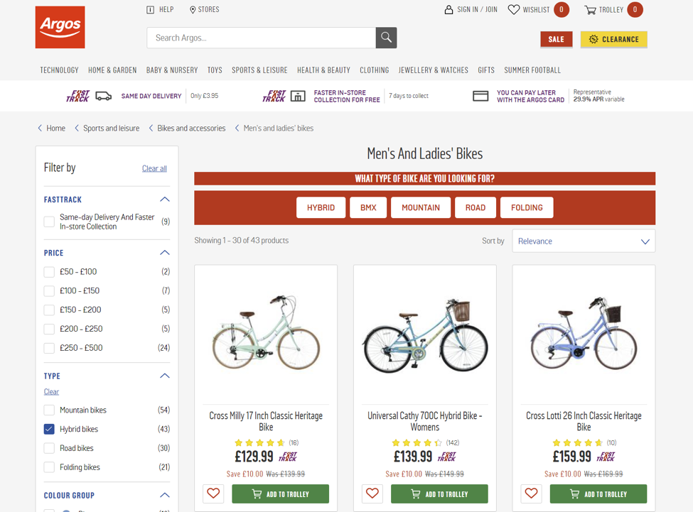
(Argos)
Without these various filters, covering price range, colourand brand, users would spend too much time endlessly scrolling through the products, and would leave before converting.
So if you have lots of products like Argos, keep the number of filters as low as possible, because having a million filters is just as annoying for the customer!
How to Apply This
Your CMS manager, like Magento or Shopify, should have categories already in use for your site products. In order for your products to show up in filtered searches however, they must be categorised correctly to fulfill your user experience.
Task your team with checking each of your site categories, and ensure that product categorisation is a key part of your inventory uploading process.
Clean Design
If your website is busy, crammed full of graphics, GIFs, ads and banners, you will lose users like nobody’s business. Google actually released research proving that sites with busy and cluttered designs lost more views than cleaner, simpler sites with less visual stimulation, which goes on to prove that less in fact is way more when it comes to the Web.
SkinnyTies experienced an awesome 14% increase in revenue thanks to a site design ‘clean-up’, turning their dark, dated and dull homepage into a clean, fresh and functional conversion machine.
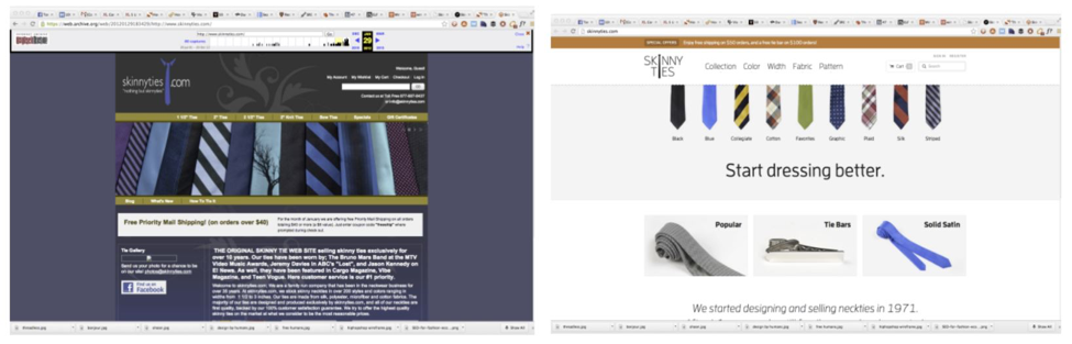
The redesign not only made it apparent that this was in fact a retail store, not a Wikipedia page on the history of ties, but lightened the page with white space to give the user metaphorical ‘breathing room’. Claustrophobia can occur on the internet too, so lighten up and let your users relax!
How to Apply This
Go through your site and take stock of your page layouts:
Is it cluttered and busy?
Is it dark and moody looking?
Are you inclined to stick around on this page? If not, make a note of why.
Using this information, your team should go through the problem areas and prepare wireframes to propose a new design, with a focus on white-space, freshness, navigation and customer value.
A new site design gives you the opportunity to really create something valuable for your customers. Keep them coming back to your business for your beautiful aesthetic, your valuable service and your personable and authentic brand.
Design is a huge part of your success, as you now know, but it’s definitely not all of it, as if your design isn’t user friendly then it isn’t serving you as it should be. It’s not just about colour palettes and typeface, it’s about how the flow of your site design works with your user’s habits, and when it’s done right, it creates an effective and beautiful site that consistently converts and engages your motivated and highly engaged target audience.
Don’t panic though! Not everyone is equipped with years of expertise and success in the Web Design industry, but luckily iNS is. It’s crucial for you to have a tailored, flexible and high-converting site, and our team will work alongside you to redesign your site to produce consistent conversion levels of engagement that you never thought you’d see.
Success is always possible, you just need to right team around you, so give iNS a call and start seeing the results you want today.